Michigan Online
Implementing a flexible, scalable design system
Overview
Michigan Online serves 200K+ account holders and a funnel of 12M global learners. The site's design had evolved only in minor ways over five years. It was time for a visual refresh.
The team saw this as an opportunity to improve not just what the site looked like, but how it was built. We executed a design system-driven approach using a pattern library and a more robust, testable set of components.
Where: U-M Center for Academic Innovation / September 2025 - March 2026
My Role: I worked as one of two full-stack developers alongside 5 UX designers, 2 project managers, 1 product manager, and 2 marketing team members to rebuild the site. I scoped designs for technical feasibility and reusability, prioritized high-impact components, and applied BEM CSS conventions, accessible HTML, and modular Wagtail blocks to build flexible, scalable, testable components.

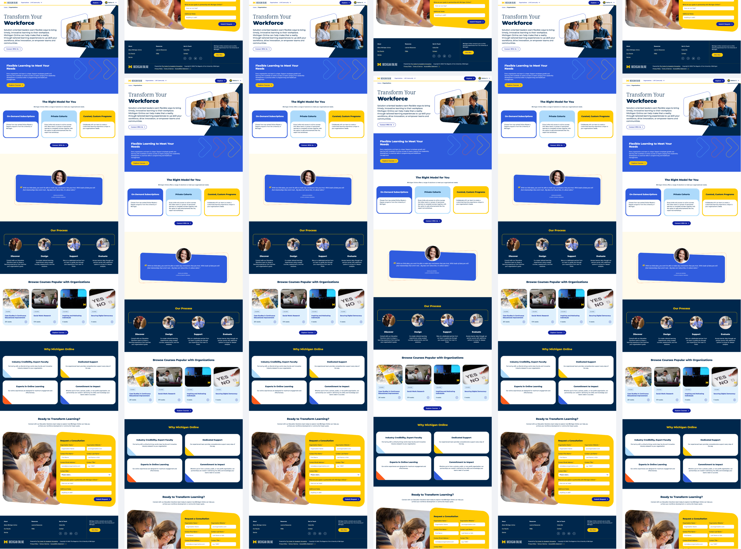
The ProblemBuilding 28 pages, 40 components, 174 instances in 6 months on a small team
Creating "reusable" components is harder than it sounds, especially on a small team working under a 6-month deadline. Each component needed to handle real-world content variations, adapt to different contexts, and stay maintainable as the system evolved.
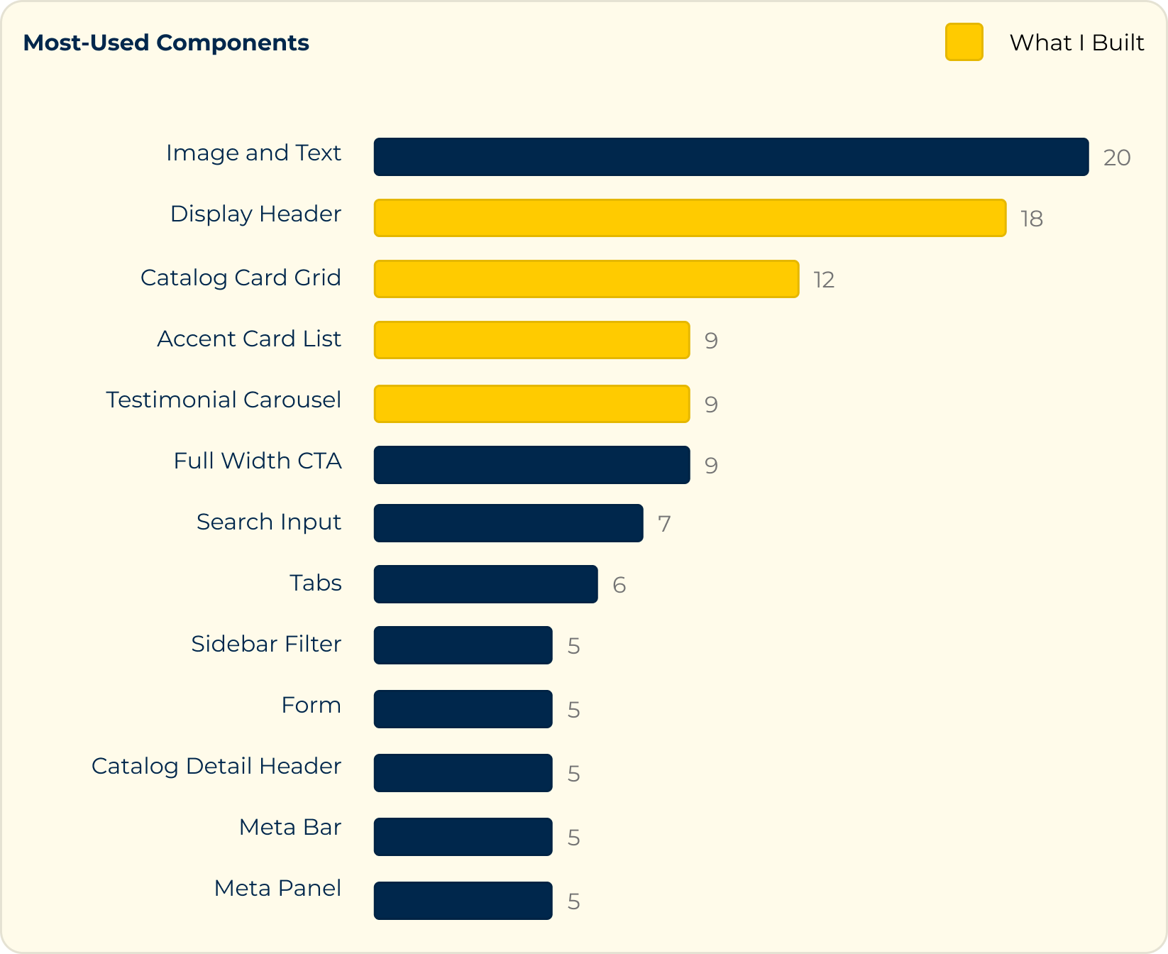
I built 13 components (including 4 of the top 5 most-used ones) over the course of the project, each requiring careful thinking about flexibility, abstraction, and edge cases. Every component was a design problem and an engineering problem.
The ProcessThinking strategically and systematically
During development, I adhered to the following guiding principles:
Minimize decision fatigue for content editors
Power abstraction with shared HTML anatomy
Chunk implementation in modular steps
1. Minimize decision fatique for content editors
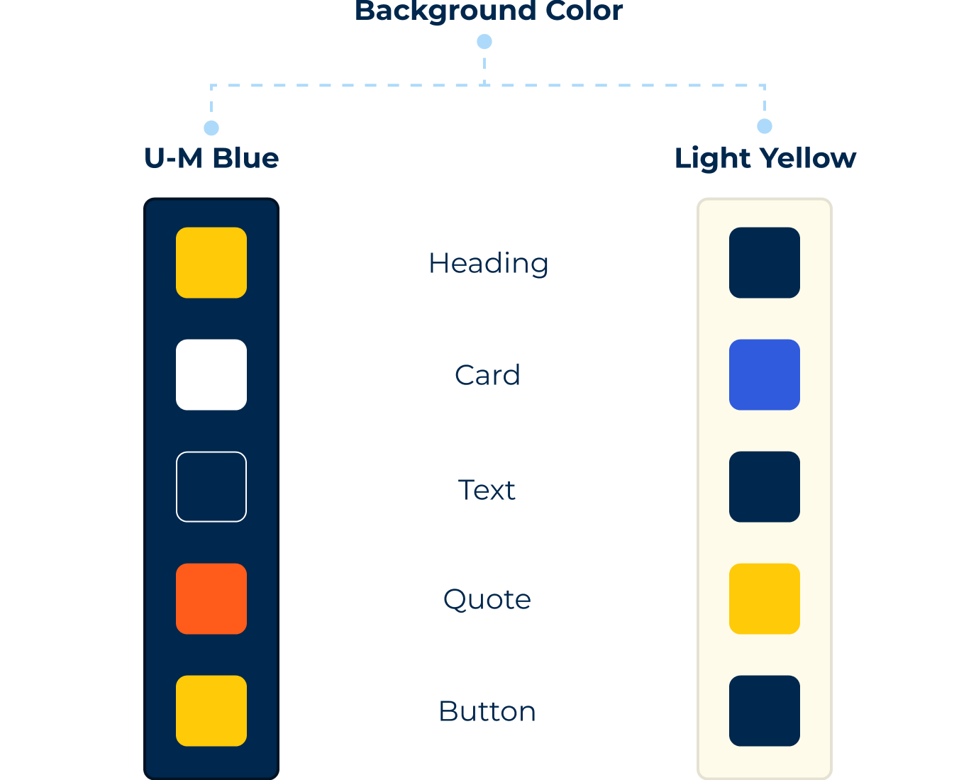
Testimonial cards needed to work across different page sections, each with their own background color. Instead of forcing content creators to manually select the right color for each visual element in every context, I built the card to auto-adapt its background color based on the parent section. One background choice, one component, zero decision fatigue.
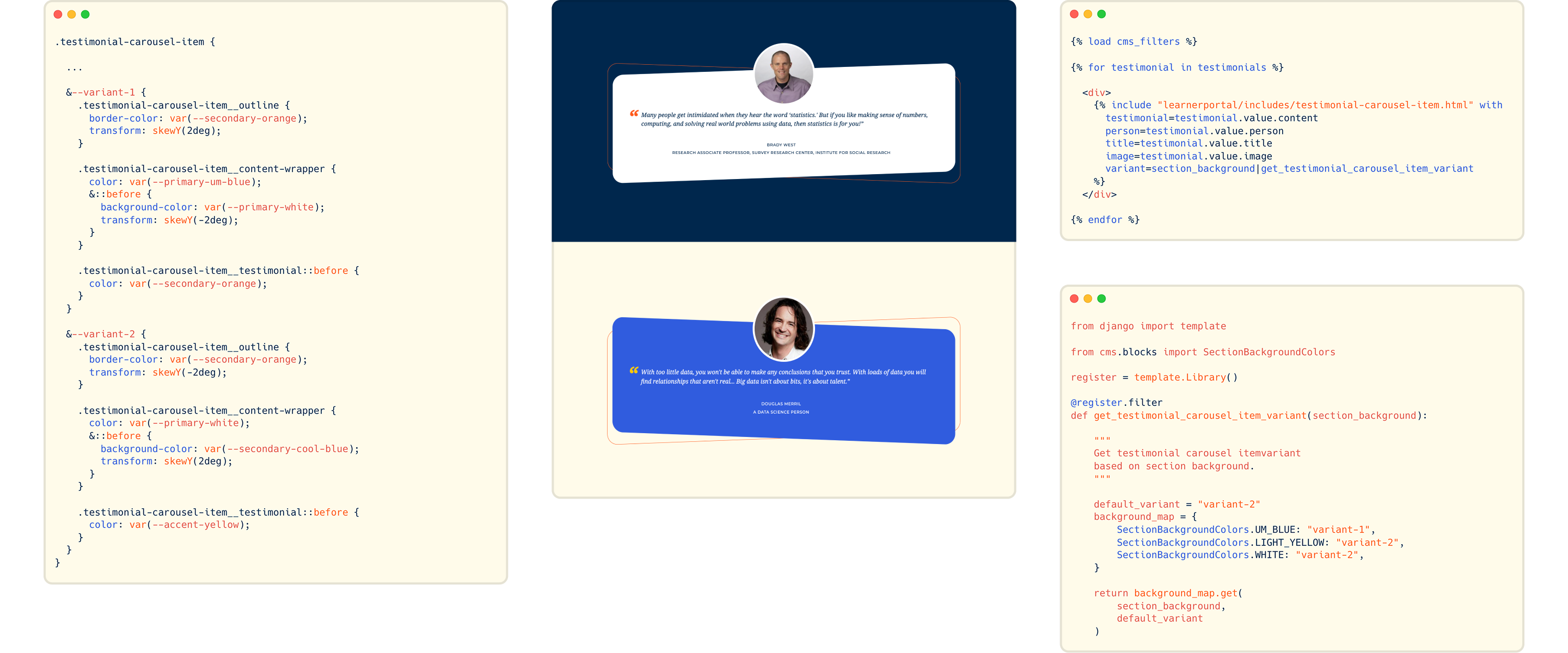
2. Power abstraction with shared HTML anatomy
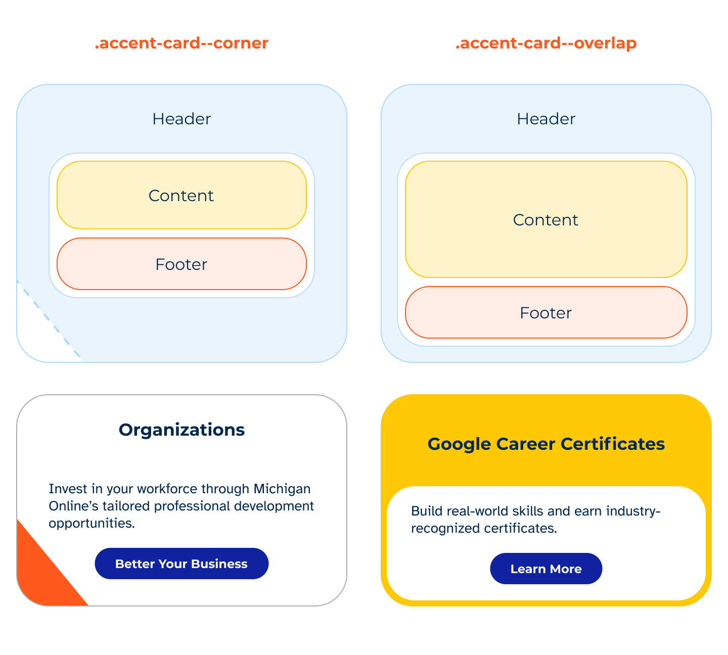
The accent cards came in two visually distinct variants. But on closer examination, I determined they could share the same underlying structure. I built them with a single HTML structure and CSS modifier classes, changing the visual style without touching the markup. The cards also handle optional CTAs and variable content length (especially headings, where height needed to match across cards in the same row).

3. Chunk implementation in modular steps
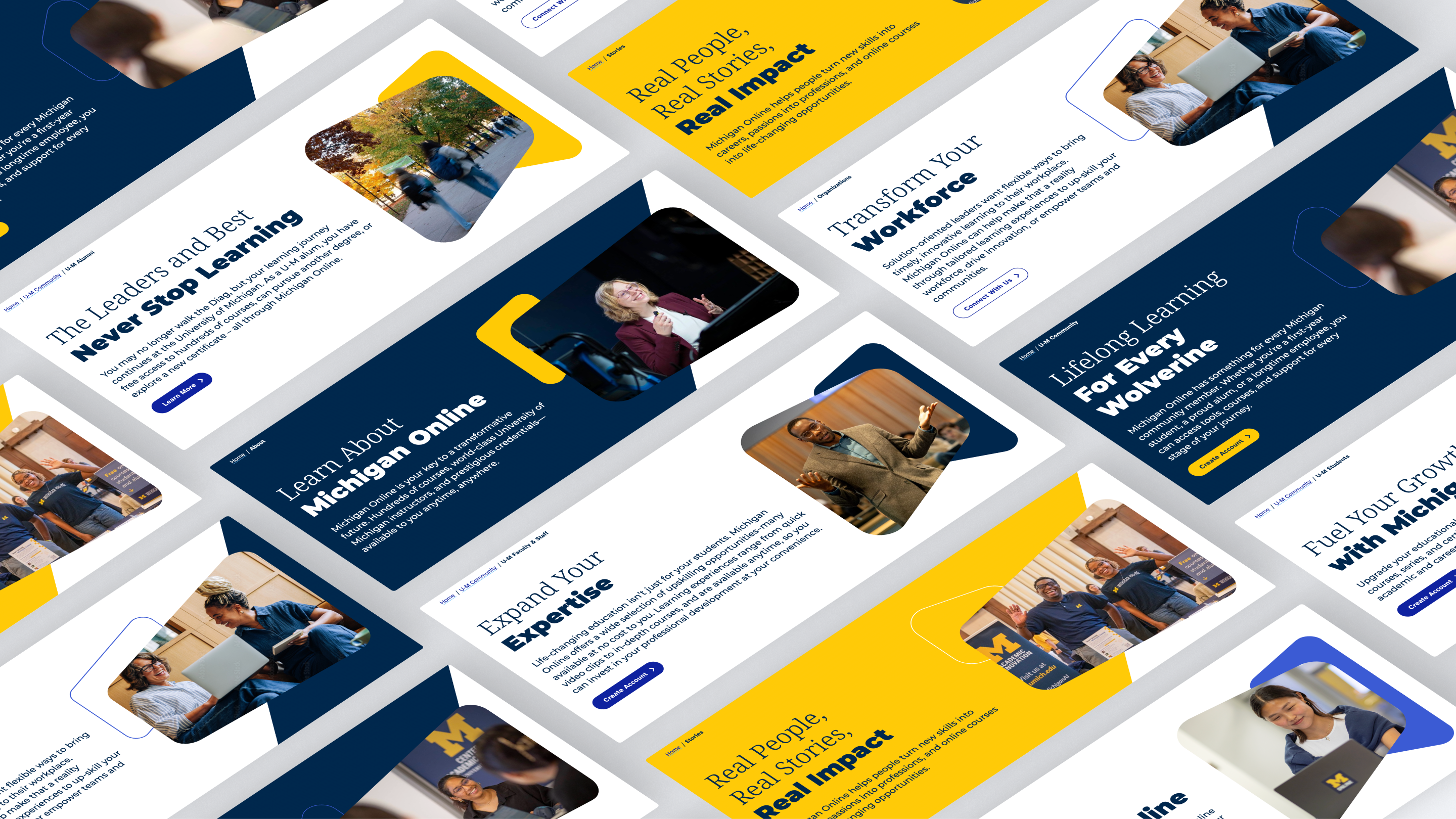
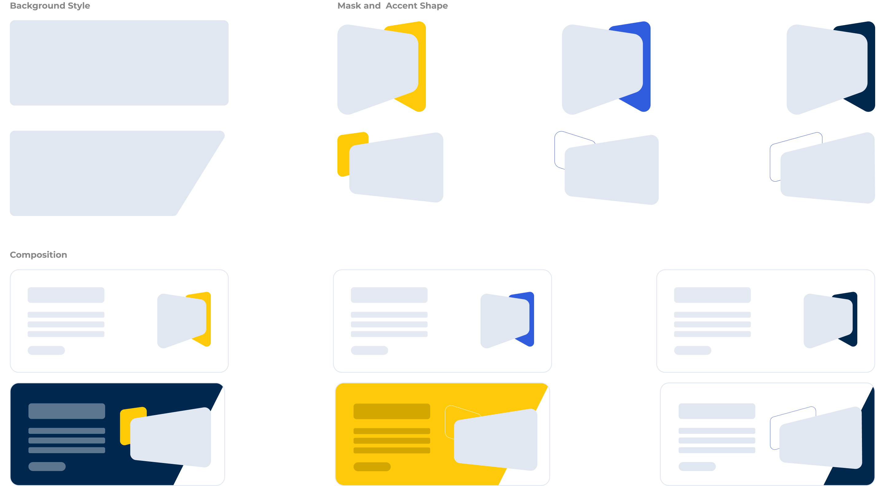
The display header component was one of the most-used components in the redesign, and contained 6+ variants. To balance configurability with minimal decision fatigure, I paired design-approved background colors, accent shapes, and clipping masks for a constrained set of options.
When building the component, I worked in small chunks; starting with the background color options, then adding the clipping mask/shapes with proper aspect ratios to prevent image distortion, and bringing them all together with a streamlined set of CSS modifiers.
The ImpactIncreased development velocity by 66%
I built 13 components with 21 variants used 66 times to serve 200K+ users and a 12M global learner funnel.
The impact of this work really shined in the latter half of the 6 month sprint, when the team was able to create new pages with mostly existing components in less than a week, rather than the initial 3+ weeks needed to develop new elements from scratch.
The most collaborative part was scoping the blog CMS blocks: meeting with devs, designers, and content folks to prioritize what to build and iterate on the authoring experience until we could recreate 80+ blog posts in the new system.
The design system is live, powering the Michigan Online rebrand with flexible, maintainable components built to last.