Michigan Online
Increasing the transparency of ratings and reviews for an online course catalog
Overview
Michigan Online is your destination for global, lifelong, and engaged learning with the University of Michigan. For this project, I performed comparative analyses, ideated design solutions, and conducted usability tests to increase user satisfaction with online course ratings and reviews.
Where: Michigan Online / 2021
My Role: As the lead UX designer, I led user research and design while collaborating with a backend developer.
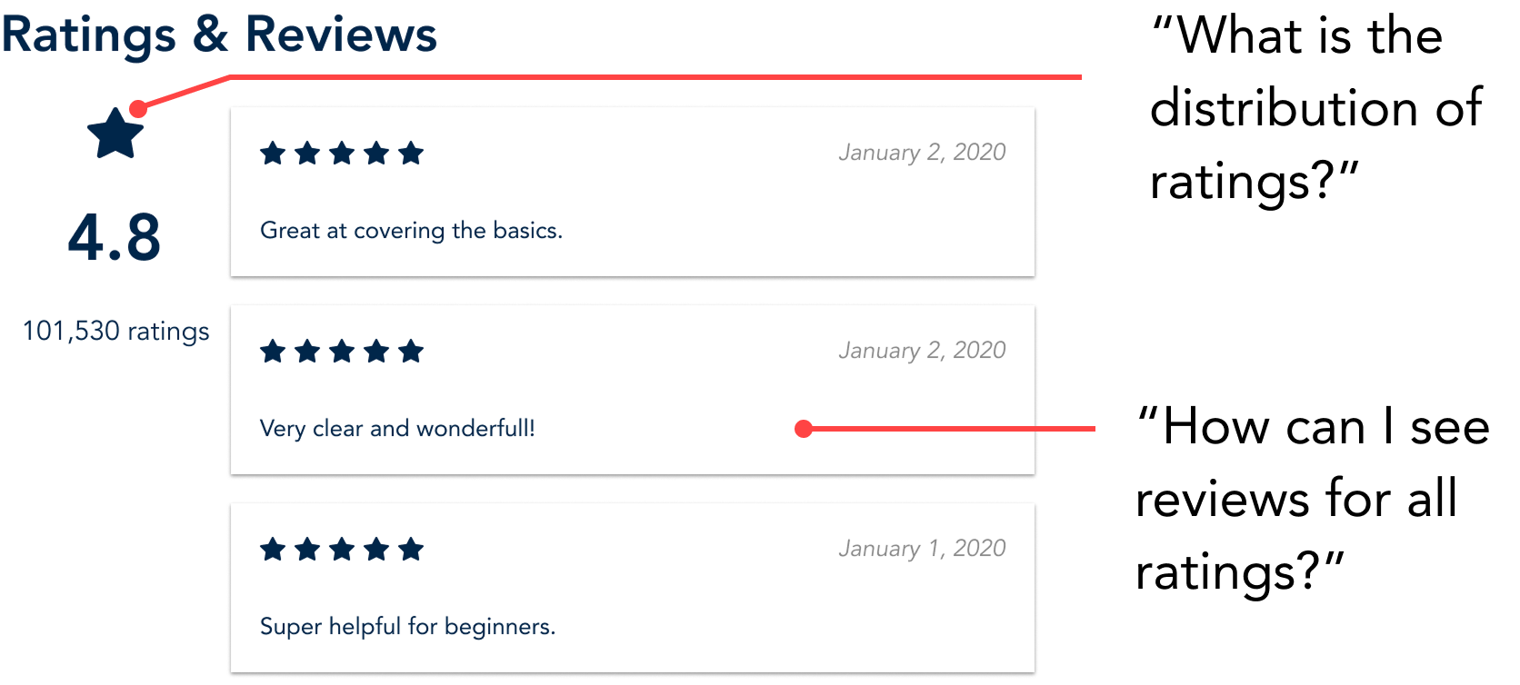
Incomplete rating info
Course pages lacked sufficient detail when it came to displaying rating and review information.
Consumer trust is key
Why was this a problem? A well-designed review section contributes to an organization/product's overall reputation, and increases consumer trust in the quality of their purchase. Visibility into the full array of reviews (not just the most positive ones) also improves the credibility of reviews.
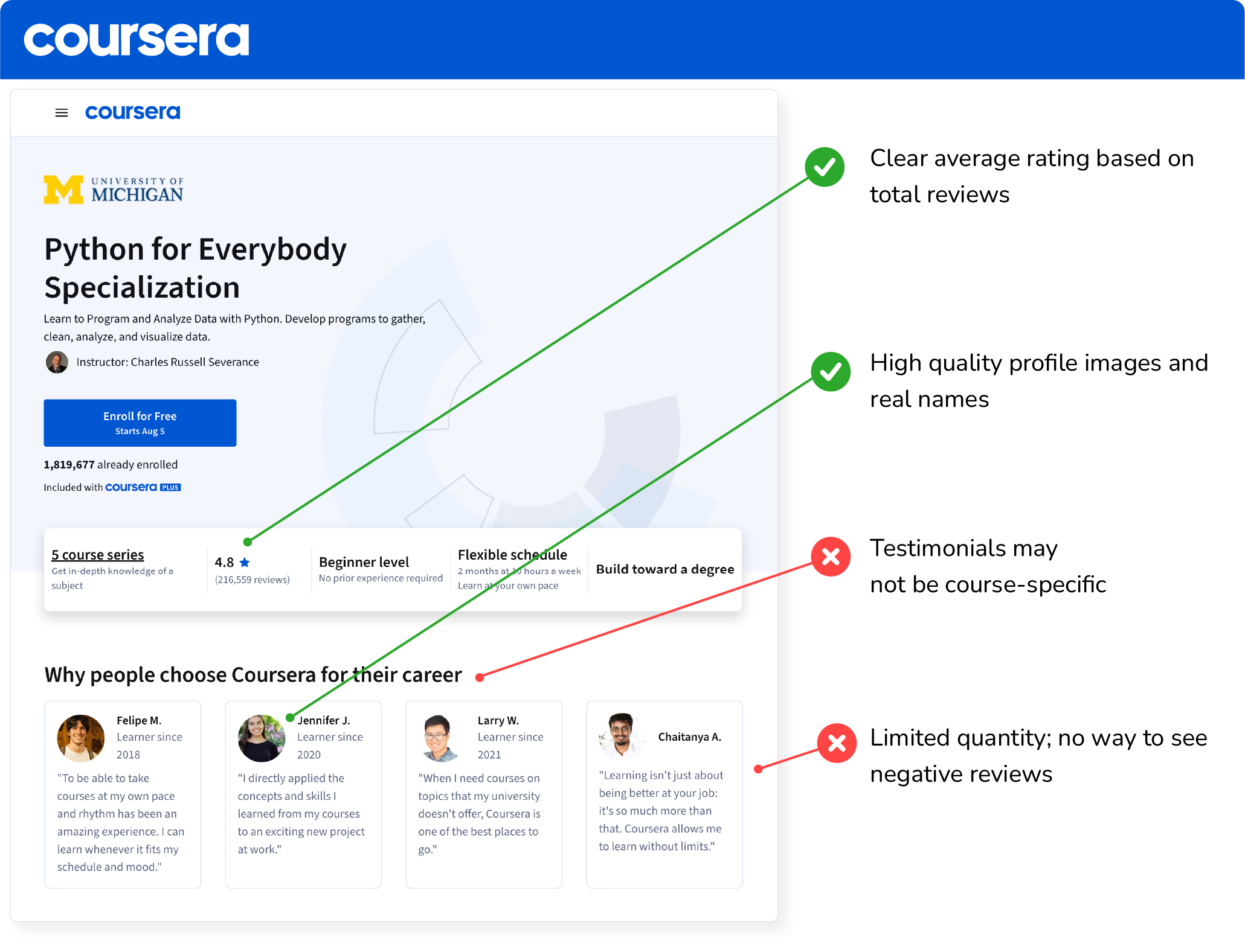
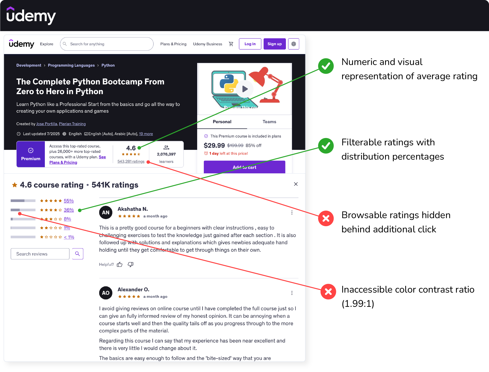
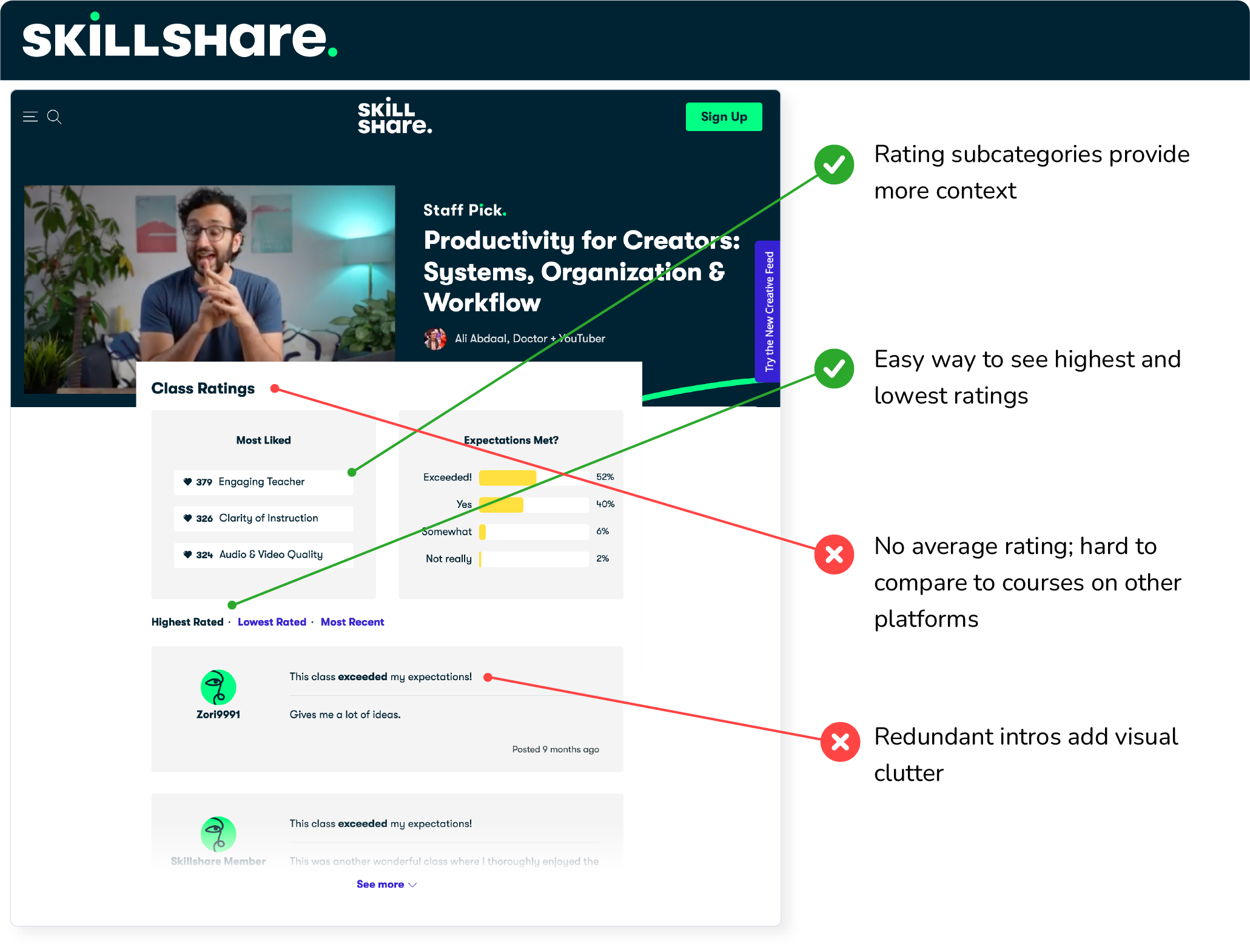
Competitor inspiration
To inform my design process, I first examined how three other online learning sites present ratings and reviews for their content:
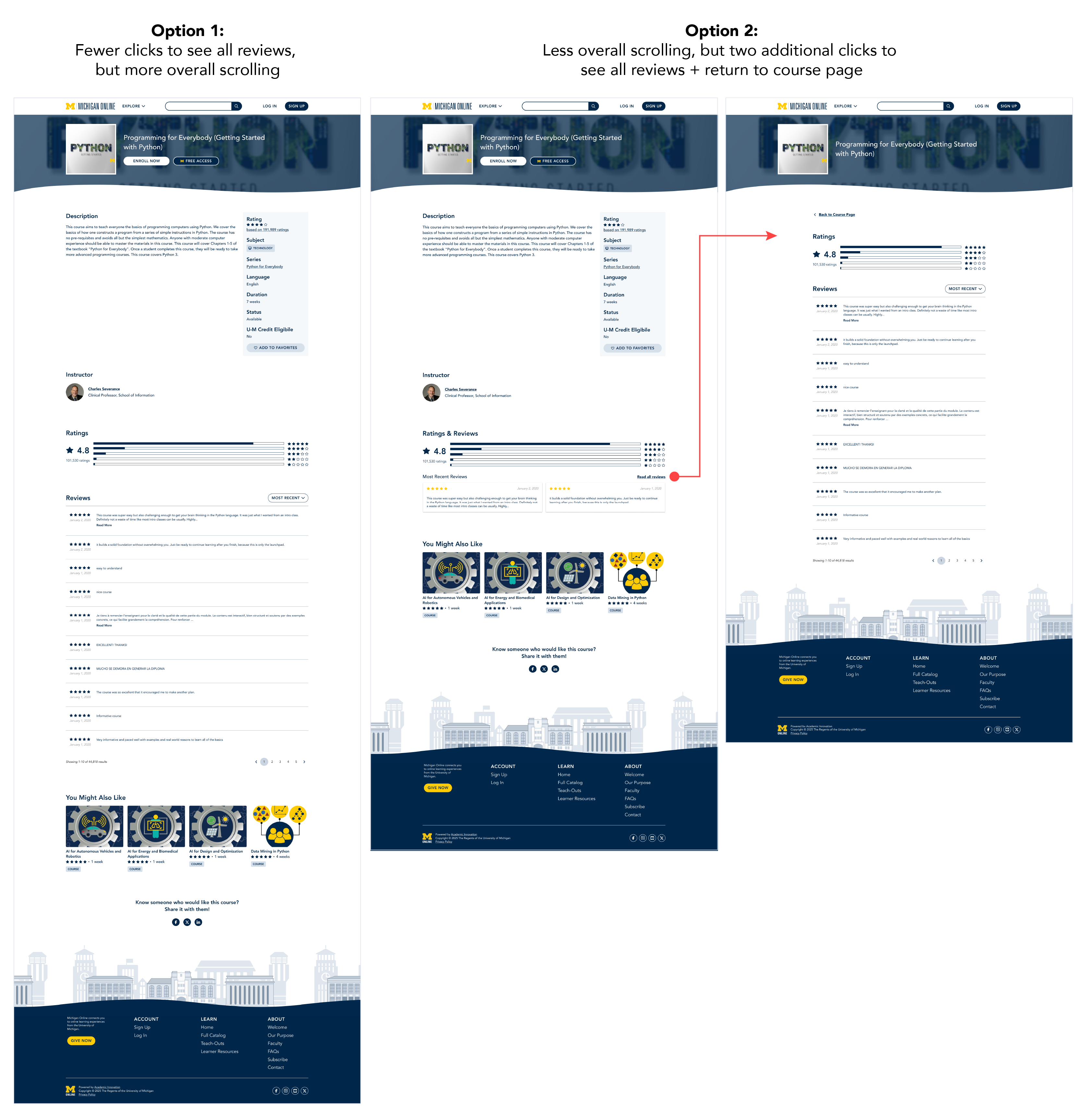
Hi-fi solution exploration
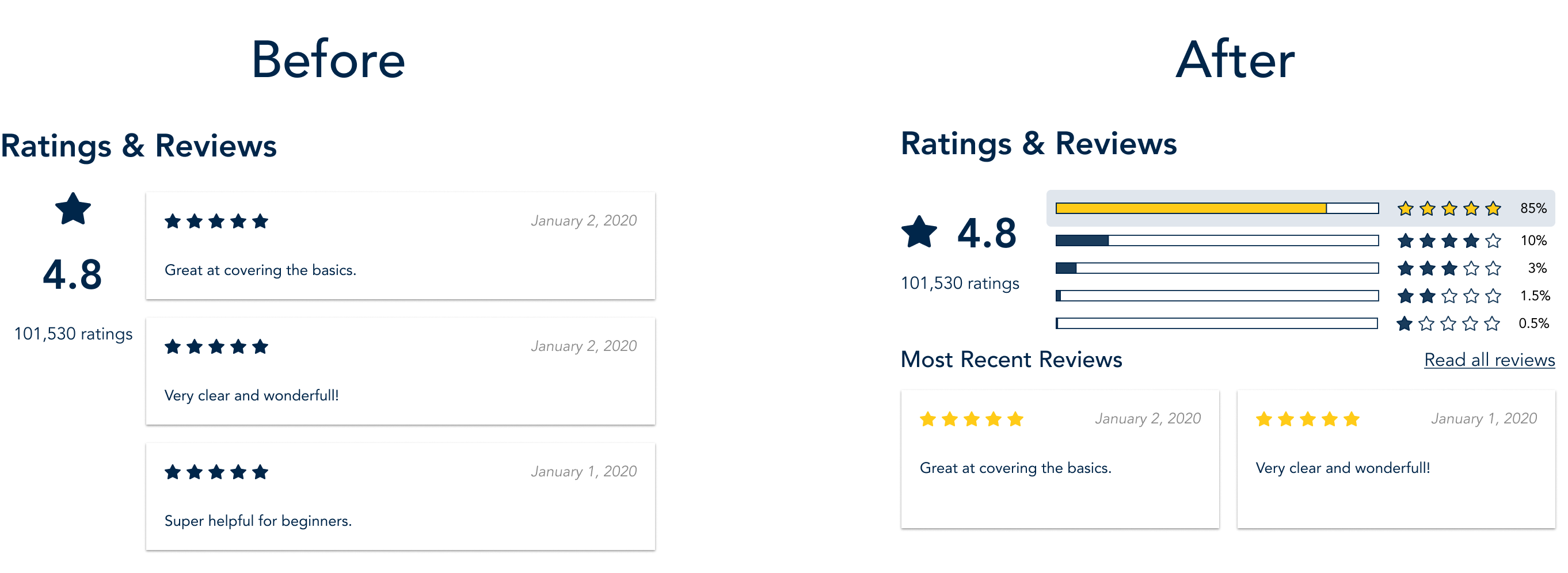
I then explored two approaches: one that kept all rating and review information on the main course page, and one that separated the exploration experience into two pages (offering surface-level information on the main page and a list of full reviews on a different page).
The first design minimized clicks but increased scrolling on the page as a whole. The second design provided a more progressive exploration of the reviews, but obscured the full set of reviews behind an additional click that some users might miss.
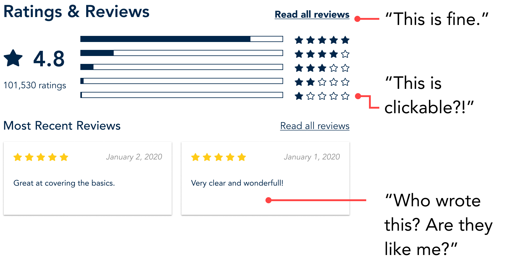
A/B Usability Testing
After that, I conducted 5 usability tests with undergraduate students who were experienced with online learning.
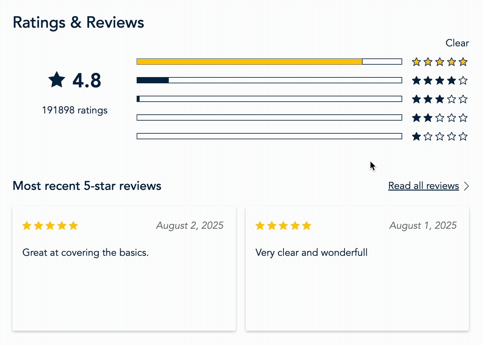
Increased transparency
The outcome of this effort was a more interactive, transparent course rating section that allowed prospective learners to explore the full set of reviews for a given learning experience.
Now that the design is implemented, I'd like to collect quantitative measurements of user satisfaction, and monitor click-through rates between the course and review pages to guage usage.