Before and After: Updating My Portfolio Illustrations
Design recruiters and hiring managers are busier than ever these days. So the amount of time they spend reviewing your portfolio isn’t nearly as long as you might think.
This means you need to make a strong first impression in a matter of seconds. And one of the best ways to do that is with engaging, high-quality visuals.
That’s why I took a fresh pass at the primary images on each page of my portfolio.
Where I Started

A collection of self-portraits intended to thematically introduce the subject of the page, the previous images were professional, warm, and friendly. However, their facial expressions and postures lacked differentiation, personality and detail.
Desired Style
In addition to remaining professional, warm and friendly, I wanted to instantly convey to viewers that I’m a designer with:
- a playful style
- energy
- strong artistic ability and attention to detail
Iteration 1 - Make It Playful
For the first iteration, I drew inspiration from the reference image below to explore a whimsical line-based, dual-chromatic style:


While they achieved a simple, playful look, the “quick and sketchy” nature of the figures didn’t convey enough detail for me.
Iteration 2 - Make It Playful AND Detailed
During a second iteration, I reviewed Duolingo’s character design recommendations, which helped me understand how to create engaging facial expressions and dynamic poses from simple shapes.


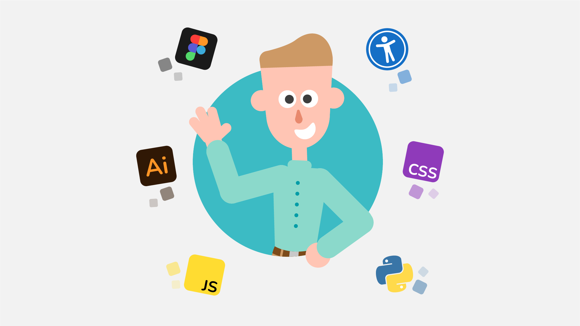
Final Details - Create Supporting Visuals
Satisfied with the new playful style, I crafted a set of supporting icons/visuals to underscore the theme of each page (e.g., home, about, illustrations, etc).
![]()
The Result
After bringing the figures and supporting icons together in casual, semi-random rotations, I sprinkled in some additional shapes for subtle movement and personality. And voila!
